Thursday, 29 March 2012

Evaluation- video 7

Looking back at your preliminary task, what do you feel you have learnt in the progression from it to the full product?

I feel like I have made a lot of progress since the preliminary task because that was my first experience of using Photoshop and creating a magazine. In the preliminary task I had no knowledge on Photoshop and how to create different effects or even cut out images. I also had no idea how to use the cameras and only took the photos I needed. This made it very limiting as I had to use the only pictures I took and had no options to choose from. I didn’t really know the general characteristics that magazines should have so I had to guess for a lot of the sell lines and the positioning of the text.

Since completing my final music magazine, I think my knowledge of Photoshop has increased massively and after watching various tutorials I now know how to edit photos and create different effects that are commonly seen in magazines. For example, I now can cut out a photo successfully and make it look professional. My general knowledge of magazines has become better and I now know what key features are always included and what can be adapted for various magazines. This knowledge is reflected in my work as you can see the difference when you compare my preliminary task to my final task. For example, in my double page spreads I have learnt to use rulers to make sure my work does not go down the middle of the page were the fold will be, and to make sure all sections on the page are equal. This makes the page look overall more effective, and also I wrapped the text around the image which made it look of a higher quality.

When it came to my photo shoot for my final magazine, I now knew to be more prepared and have shot ideas in mind before I had the shoot. Therefore I did research and found different looks that I wanted to create for my magazine and made sure they were possible for me to do. I considered the different locations as I knew I wanted some outside shots for the double page spread, but also mainly shots inside in the studio so I could easily cut them out in Photoshop. This also made the lighting better for me to get a good front cover image. I made sure I took a wide variety of photos so I had numerous options to choose from for my magazine.

Overall, my skills on Photoshop have improved the most as I now automatically include drop shadows on my sell lines and know how to make the colours match with each other. I feel I have learnt what looks appropriate for a magazine and I have learnt the general characteristics that are found in a magazine and how to alter them to make it different from other magazines, but still recognisable at the same time.

Wednesday, 28 March 2012

Evaluation- Video 6

Evaluation 6


What have you learned about technologies from the process of construction of the product?

Throughout the AS project, I have learnt how to use Adobe Photoshop a lot as that is what I created my whole magazine on. I think this is a suitable programme to use as it gives the whole magazine a more professional look because of the certain effects you can apply to text and images, and also how you can lay out the magazine in general. I learnt how to effectively cut around images in various different ways in Photoshop and this links to other useful technologies I used as YouTube helped me to learn how to do various things in Photoshop.

On YouTube I found numerous tutorials to help me create different effects I wanted in my magazine and I found these useful as they talked through the process step by step. I used this method of learning to help me create the Polaroid pictures on the contents page and also on how to cut out images successfully which I then used throughout my magazine. I also looked different artists that I had mentioned in my magazine on the contents and front cover and listened to their style of music to make sure it fit in well with my theme of indie/rock. I then placed these videos on my blog as part of my research before I created the magazine to make sure I had looked into the artists to check they were suitable before using their names.


Another new programme I was introduced to when completing my coursework was Adobe Bridge. This enabled me to create a contact sheet for my photo shoot, which is an easy way of displaying all the photos I took so I can place them on my blog and I can easily see all the photos. I also used Adobe premier to create a time-lapse video. This was done by a camera taking a photo every 5 seconds throughout the photo shoot, which I then put together to make a fast forwarded version of my photo shoot in premier. This is to reinforce that I actually took all the different shots myself and thought of all the shot ideas too.


Also, I used various search engines such as Google and Picsearch to help me find images and also information on bands to help me with the preparation of my magazine. These were used when completing the mood board and colour scheme tasks. Information websites such as Wikipedia also became very useful as they helped me to look at the background of existing magazines such as Q and NME and enables you to measure their success.  I also found out a lot about the different media companies that own magazines and this gave me ideas on which company I would like my magazine to be published by.


Finally, I started to use my webcam at home to make video diaries on some weeks and also to record peoples opinions on my magazine so I can post their feedback on my blog. I find this a good way of doing my diary entries as I can talk about what aspects I found hard that week and also what I completed each week. It makes it easier when I look back at my progress to see how much work I have completed each week and to see if I am on schedule.

Tuesday, 27 March 2012

Week 23- Diary

This week i created my video 5 for the evaluation. I have varied the different types of media within each video to show off my magazine in various ways. For this video i created a powerpoint and then used Camstudio to record it and put it into premier. I then used a dictaphone to make a voice recording to go over the top of my powerpoint so i can explain what is happening on screen.

I think these media types are effective because it engages the reader in the video as they can hear your voice and then link it with the images being shown and see how i have applied my knowledge into different pages of the magazine.

Evaluation- video 5

How did you attract/address your audience?


To ensure my magazine sells, I have made sure I included the general features of a music magazine, but adapted it to ensure that it’s unique and stands out from similar magazines of the same genre. I have made sure there are various different exclusives and artists included in the magazine, which are aimed to appeal to the specific target audience of the younger generation.
The front cover and the contents page have the colour scheme of red, white and black and the contrast of red against the plain black and white catches the reader’s attention straight away and makes the red stand out more and look alert.  I used a mid shot of a female model of a similar age to the target audience as they can then relate to her and will find the magazine more appealing.  Including lots of sell-lines on the front cover makes it more attracting as people are more intrigued to read the text and pay more attention to the cover.
The contents page continues with the same colour scheme and the background includes a powerful and engaging image with a stripy pattern. I also included various other pictures of artist to give the audience a taste of what to expect in the magazine and this allows them to then make a decision as to whether they will find it interesting or not. In the banner along the bottom of the page, I have included numerous different recognisable icons such as Twitter, Facebook and YouTube. This is to attract the reader and inform them that there are many different ways in which they can receive information from Signed and also that they can contact the magazine in various different ways. Another way I have tried to address the audience is by including extra information underneath each page reference on the contents. This gives a little more information on each page and a quick overall summary of each article and interview. Therefore the reader can have a quick insight to the overall content of the magazine.

My first double page spread including just the image and the quote from the artist engages the reader as the image is the main focus and catches our attention straight away because of how powerful it is. The artist has eye contact with the camera and this will draw the reader in and make them more inclined to read on to the full article. I chose a very sophisticated photo to make it more appealing to the younger generation as young females can aspire to be like the artist. I think this is a good way to also introduce the article and persuade people to read on further.

My final page in the magazine is the article double page spread. I again included images which link to the artist in the first double page spread to keep the theme continuing and also to make the article itself more appealing as you can see who they are interviewing and it ties the images and text together. I included ‘exclusive’ at the top of the page to attract the reader as they then know that the content of the article is all new and not information they already know. It reinforces that it new news and the latest information on the artist.

Monday, 26 March 2012

Week 22- Diary

This past week, i have completed my fourth evaluation video and i did this by using premier to put together a compilation of screen shots, youtube clips and jpegs of my magazine. I was adressing what my audience would be and why according to the different features of my magazine.

Displaying it in this format is useful because i can easily see what features of the magazine are appealing to people and it also gives me a chance to explain why i chose to do certain things on my magazine. Also, identifying my target audience makes it easier for me to design the magazine as i know who i am trying to attract and make it suitable for.

Sunday, 25 March 2012

Evaluation- video 4

Who would be the audience for your media product?


My target audience is the younger demographic between the ages of 16-24 as I think the magazine has a rebellious and fun side to it and we are generally more adventurous at this age which compliments each other well. This Is the age when teenagers are often trying to find their style and I think my magazine caters to this as it’s about new and upcoming artists too so is easy for new people to read and those who are new to the genre can still find it interesting.

There is no specific gender as I wanted the magazine to be unisex and appeal to as many people in this age bracket as possible to make it more of a success. Therefore I used the colour scheme of black, white and red as they are appealing to both genders. This also links with the theme of Indie/Rock which again narrows down the audience as the magazine only includes one genre. However, it is a large genre and therefore there is enough information in the magazine to make it interesting and also attract new people who many not know much about Indie or Rock music. The two genres Indie and Rock often cross over with each other so including them both in one magazine also brings the fans together and makes the overall magazine more desirable to customers.                                                           

The magazine is aimed at middle class people and the price reflects this as it’s around £3-4 which makes it competitive with other similar magazines, but is also good value for money because of the content of the magazine. Also the lexis Is very middle class and therefore wouldn’t appeal to those who are of a higher class. The cover model and the poses she uses suggests that she is very rebellious and quirky which is reflecting on what the target audience is expected to be like and suggests that they should have a busy and interesting lifestyle. The magazine is full of festival news and tour dates which suggests the readers must be interested in music events and socialising with people all the time to make them enjoy the magazine. The cover model being in her teens herself automatically makes us think that this magazine is aimed at people of a similar age to her as they can refer to it easily and will also be more interested to know about her music and how she entered the music industry etc.

Wednesday, 21 March 2012

Evaluation- video 3

What kind of institution might distribute your media product and why?
There are four main distributors for magazines and they are Bauer consumer media, IPC media, the national magazine company and Conde Naste. I think the best company to distribute my magazine is Bauer consumer media. This is because it’s an International company, therefore will help to widen my target audience and make the magazine more recognised across the world, rather than just in the UK. However, the downside is that it already distributes similar music magazines such as Kerrang which is the rock genre and also Q magazine which is rock. This means they will have the same target audience as my magazine, but I think this could work to my advantage as the Bauer Company will already have experience and knowledge of the industry so they can then apply this to the distribution of my magazine. I also think that I have a younger target audience than Q and Kerrang and they are more rock based so this is a clear difference from my magazine. The Bauer Company has also produced many other magazines such as ‘Take a Break’ and ‘Empire’ which are not related to my magazine at all which is useful as they will not have as many similarities. There first magazine was produced in 1987 which gives me confidence that the company has a lot of experience and knows how to make a magazine successful.

                The Bauer Company would be interested in my magazine as they do not currently distribute one with the indie/rock genre. Even though they produce rock magazines, they are very different as the interests for the magazines do not overlap and they are both targeted at different ages, as mine is for the younger demographic. My magazine also has a lot of potential as it can become more successful as it gains more readers and status. It will be able to get bigger artists and will also gain their trust, meaning it will feature better articles and exclusives. The magazine follows some of the typical conventions of a music magazine; however I have altered it slightly so it’s quirky and unique and is not afraid to try something new. An example of this is the shot I have used for my front cover page. I decided to move away from the typical close up shot and instead substituted it for a long shot of the artist cross legged. This makes the front cover have a more powerful effect on the reader which is what was intended as this is the first page they will see and is what will draw the audience in.

Tuesday, 13 March 2012

Week 21- diary

This week i have managed to complete my second evaluation video and also made a start on my third. The second video is talking about how different social groups are reflected in the magazine. I created this by using Camstudio to film a prezi i had made. I then made a voice recording to go over the top of the prezi and this
reinforces the images and text i have written. I then synced the two together in premier and now the finished video can be found on my blog.

Evaluation- video 2


How does your media product represent particular social groups?

 
My music magazine is aimed at teenagers and young adults around the age of 16-25. Therefore the model I have used to represent the main artists is in this age bracket to make it more appealing to people of the same age.

On the front cover, my main image is of a female artist sitting crossed legged. This is eye catching as it’s an unusual shot and she is looking directly at the camera. This makes it more personal and targets the reader straight away. Her quirky clothing makes us think that this reflects the type of personality that she has and also what her music may be like. This then attracts the reader to the magazine more as the younger generation are always looking for something new and exciting. Her clothing is all black white and red which links in with the rest of the colour scheme and the typical indie/rock genre. The red lips and bow tie connotates danger and could also suggest to the reader that she’s rebellious and is going to bring something new to the music industry. She has a positive facial expression which is playing on the typical rock/indie poses as they normally portray a unhappy look and try to be mysterious. However the positive look draws the reader in and makes the magazine more inviting.

My contents page continues the theme from the front page and the background is an image of the legs of the model from the front cover. The audience can then link these pages together and see how this artist is going to be featured a lot in the magazine. The artists is wearing striped trousers which catches the readers eye straight away and is appealing to the younger demographic who are always looking up to artists for new fashion ideas and trends. I have laid the page out in sections to make it easier for the reader to navigate their way around the magazine and this also helps to appeal to all different social groups as they can clearly see which sections appeal to them and which do not.

My first double page spread is just an image of the artist and a quote which relates to her. As she is the same age as the target audience, this page can be seen as quite inspiring to the readers as the pull quote also reinforces that her life was changed by music and that she was once an ordinary person. This represents the younger demographic well as it signifies that anyone can do something if they are dedicated.

My final double page spread includes my article and also another set of pictures of the artist, linked to outfit change on the first double page spread. The outfit has changed to a winter theme of pale greys and pinks and this makes it feel more feminine and helps to draw in the female target audience. I think the outfit is again very quirky and unusual and therefore reflects that of youths today. The language used in the article is very conversational and has a relaxed tone to it which keeps it very informal and consequently more enjoyable for the younger demographic to read.

Saturday, 10 March 2012

Week 20- Diary

I have started my first evaluation question this week which was 'In what ways does your media product use, develop or challenge forms and conventions of real media products?' To create this i have made a video in premier, which includes different examples of magazine and pages and also Youtube clips to reinforce the types of bands within the magazine. I then recorded a voice over for the whole of the video to explain what the video is showing and what typical conventions i have included in my magazine and which i have changed slightly.

Thursday, 8 March 2012

Evaluation- video 1

In what ways does your media product use, develop or challenge forms and conventions of real media products?
             As the front cover is the only page that will be on show to readers at first, it has to be eye catching and grab their attention away from the other magazines. I felt it was a good choice to use the typical black, red and white colour scheme because then the genre is obvious to readers and fits in with other magazines. However I didn’t make my main image the typical close up shot, but instead a long shot of a features artist which changes the typical layout of a magazine.The banner across the bottom of the page is in a solid black colour which makes it overpower the stripy pattern that the artist is wearing behind. It says ‘Coldplay are back’ which suggests the contents of the magazine is about successful artists and bands, automatically making us think the magazine is a success too. I also made my masthead very noticeable and different by creating a stamp effect on it to make it look more rough and worn. This conveys a sense of rebellion in the magazine which links back to the stereotypical rock star.  I included the bar code and magazine price and issue number at the bottom right hand of the  page to make it more authentic and also makes it easy for the reader to see how long the magazine has been around for and the price of it before they decide to spend their money on it. This is a typical feature of a magazine and therefore I have decided to include it in mine too.

                The contents page is very unusual and does not use all the typical features of a music magazine. Instead of dividing the page up into sections for text and images, I decided to use an image across the whole background and changed the opacity of it to make my text more readable. My heading ‘Contents’ has a bevel effect on it to give it a three dimensional look and this contrasts well with the black and white image on the background. I have used enlarged page numbers down the left hand side which are typically found in contents pages and they are key to helping the reader understand the layout of the magazine an navigate their way through it. I have included the social network logos on the page to represent that you can access the magazine online and this shows that they are trying to appeal to their audience in as many ways possible. I took this idea from magazines such as ‘Mojo’ and ‘Q’ as I thought it was a good way to attract new readers.
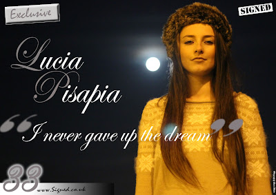
                My first double page spread consists of just an image and a quote from the artist. The purpose of this page is to ease the reader into the article and get an idea of what it’s going to be like. I enlarged the page number on the right hand side and added a glow effect as this ties in well with the glow from the moon in the image. Also, the quote overlaps the image and I enlarged and faded the quotation marks because I have seen this used in other magazines and liked the look it gave to the page. Although, I have adapted my magazine slightly from other magazines as the colour scheme has now changed to navy and light pink, as this is the colour of both my double page spreads. However I think adding this second double spread makes the colour changed work as it eases the reader into it and makes it flow better.

                Finally, my last double page spread includes my article. I kept my article in columns, the same as in all music magazines as it looks more appealing to the eye and neatens the page. I also wrapped the text around the main faded image on the right which makes the page look sophisticated and neat. I decided to use two images that take up a lot of the page. This is unusual as normally one main image is just used on half of the page, but I liked these two particular shots as I thought they were unusual. Again, like in all magazines, I included the website and page number at the bottom to constantly promote the magazine and show the variety of different ways readers can access the music information.

Wednesday, 7 March 2012

Advertising

Here is a powerpoint displaying different ways my magazine could be advertised and i have showed numerous ways in which i can reach my target audience via social networking, billboards and bus stop posters.

Advertisement

Tuesday, 6 March 2012

Week 19- diary

This week i completed my audience feedback. I did this by filming different people, all from the same target audience to see what they thought about my magazine and what they thought were the positives and negatives. I asked both media students and non media students to see if their opinions varied atall and if they spotted different things in the magazine.  I made up a set of questions to ask my audience so i could compare answers easily and see where i could of maybe improved and also what i executed well.

Audience feedback

Tuesday, 28 February 2012

Week 18- Diary

Over half term, I have finished the rest of my evaluation questions and made sure I included as much media terminology as possible. I made sure i was always considering my target audience and giving reasonings for all my choices in the maagzine. I thouroughly analysed each page and looked into why i completed them the way i did. I also spoke about how i managaed my time efficiently so i met the deadline on time.

Wednesday, 8 February 2012

Final front cover page

Final Contents page

This is my final contents page for my magazine and this page has had the biggest change since my draft. I was given various pieces of feedback for this page and i started my adding more pictures of featured artists in the magazine. I did this by using a polaroid effect to make the images stand out and look professional. I also addes a band index to give the reader a better indication of what the contents of the magazine is. I also created a subscription section to my contents which contains various other front covers to highlight to the reader that this magazine is continous. Finally, i added a bar across the bottom of the page as it looks more effective and ties the colour scheme for the whole page together.

Tuesday, 7 February 2012

Final Double page spread

This is my final double page spread which includes just an image and a quote from the artist featured in the article. This page is meant to lead the reader into the article mroe smoothly and make it flow better in the magazine. I have added the necessary changes to this page to make it a higher standard and look as professional as possible.

Saturday, 4 February 2012

Week 16-Diary

This week,  I started and finished my article double page spread for my final magazine. I used the feedback i had from teachers and peers in my class to make suitable changes that they thought were necessary. I believe i have now included all the elements for a succesful double page spread and looks professional for my final magazine. I also completed the next evaluation question for my overall evaluation for homework which means i am now half way through writing my evaluation which means i am on track for finishing my coursework on time.

Thursday, 2 February 2012

Final Article page

Here is my final article double page spread finished. I added the changes i was suggested to do from my feedback and also make sure it met the criteria of a traditional double page spread, with a few of my own additions.

Thursday, 26 January 2012

Week 15-Diary

This week i filmed another student in my media class giving feedback on my final draft of my magazine. She analysed each page giving them positive comments and also improvements. This was helpful as i could see what someone with knowledge of magazines thought about it and also she fits into my target audience so its a good indication of what people will think of my magazine.

I also completed my second evaluation question which was asking about the social goups represented in the magazine, so i talked about how i have made it specific to the younger demographic as they are my target audience. I also explained how i related it to both females and males and also tried to vary the content so i widen my target audience as much as possible.

Tuesday, 24 January 2012

Feedback

I recieved some feedback from a peer in my class and they gave me positives and negatives for each page on my magazine. This was useful because i got a second opinion on my designs and also the opinion from someone in my target audience.

Tuesday, 17 January 2012

Magazine comments

Once i had completed my final draft of the magazine, i asked people to give their opinions on it and write me positive and negative comments so i know what i need to improve on each page.

Week 13- Diary

This week i started my first evaluation question which was asking me to explain the features i included in my magazine that can be found in other similar magazines already published. I why i kept to some of the steretypical rules and didnt to some of the others to make my magazine unique. However, some features such as the barcode and website name are vital and therefore i made sure i included them. But i did make it my own my using unusual camera shots that wouldnt necessarily be used in other magazines to vary the page layout and the overall look of the magazine. I hope this will make it stand out from other similar magazines and make it appeal more to my target audience.